The Growth of Niche Apps

Mobile 101: This post is part of our educational series on mobile technology. If you are new to the smart phone/app arena, this series is a good place to start.

Once you “get religion” that mobile is the future, your next step is to decide on a mobile strategy.

If you’re a college, or any large institution, one of your first questions should be:

Do I create a general app for my institution or multiple niche apps (e.g. one just for alumni)?

Apps are one of the newest mediums for communication. Consider what other mediums do – for example, magazines:

People generally prefer information that is catered to their specific interests.

We think this preference holds true for mobile apps.

Though admittedly a very small sample size, my own little family is a shining example of this. I read news, my wife loves celebrity gossip, my daughter could dress up dolls 24/7, and grandma can’t get enough of sudoku.

Role of Apps

Apps, by their very nature and design, are meant to cater to specific needs. Since mobile devices have smaller screens, they demand a more focused mission.

The App Store has over 300,000 apps. They don’t all do the same thing.

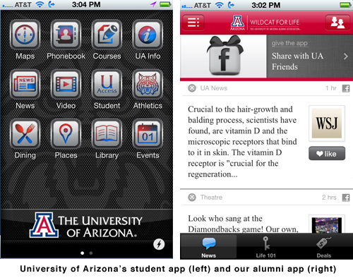
The Student App vs. the Alumni App

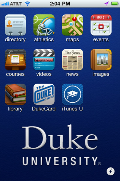
Some schools have started their mobile strategy with an app for their student body: campus maps, directories, bus routes and so on.

Duke (my alma mater) has a great student app, but it doesn’t “feel” like it’s for me, so I don’t personally use it.

In addition, alumni offices have different needs (address updates) and messaging (benefits and events) than other departments on campus.

The “Everything” App

Some schools try the “everything” app approach by including an alumni module in their “student” app.

A friend, who is a loyal UVA grad, was over for dinner the other night. We got talking about work, and she showed me the UVA “everything” app:

Her comments, which I think sum up the argument against “everything” apps were:

– Wrong messaging

It didn’t make her feel particularly special when “Alumni Resources” carried the same weight on the screen as “Grounds” and “Claude Moore Lab”.

– Lack of focus

Too many choices made her feel overwhelmed.  The UVA app reminded her of grocery shopping:

Crystal Light Overload

Personally, I think alumni want a focused app made just for them.

Spread of Niche Apps

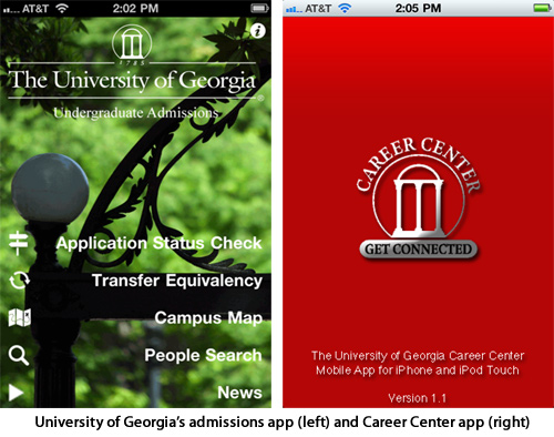
Mobile apps are still young, but the growth of niche apps have already taken root for many schools. Below are just a few examples:

Over time, I’d expect to see many schools with an admissions app, student app, sports app, and an alumni app.

Competition?

I’ve heard the question, “Will a niche app ‘compete’ against another app from my institution?”

Think of an app as less of a product and more of a communications tool.

Every school uses different web pages and different marketing materials to speak to different audiences. Niche apps play this same role.

(As an idea to cross-promote apps, add a link in each app to the other.)

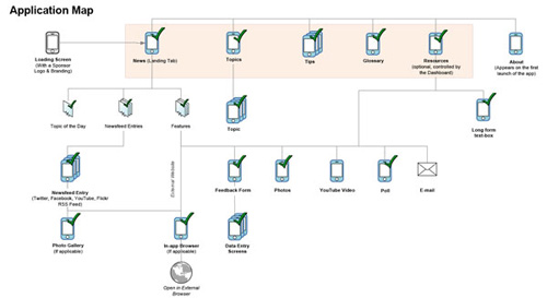
Crib Sheet, the Niche App for Alumni

“crib sheet” is a focused, niche app for your alumni or members. It offers:

– an alumni newsfeed (you select the feeds),
– alumni-specific feedback forms (e.g. address updates), polls and links,
– “life skills” topics for alumni (mortgages, insurance, money, etc), and
– promotion of alumni-specific benefits (e.g. affinity partners).

As you develop your mobile strategy, if niche apps make sense to you, we encourage you to check out our “crib sheet” app for your alumni or members.

Subscribe to the Cap & Compass Blog by Email

Update to iPhone/iPad App

In a previous post, I wrote about the benefits to removing “speedbumps” to increase usability.

We obsessively look at our app, crib sheet, for “speedbumps”.  When we find them, we go at ‘em with jackhammers.

To that end, we’re excited to announce a big update for the iPhone and iPad.

Much Faster

Behind the scenes, we’re processing thousands of social media feeds from our customers’ apps. We’re kind of like Grand Central Station.

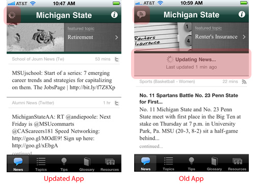
When you open the app to get updated news, you want it now. So we redesigned the “plumbing” for downloading these new feeds. The difference, depending on a variety of factors, can be significant: 3 seconds vs. 20 seconds.

Visual Tricks

When the news feed is updating, we now hide the “Updating News…” tray and give users the ability to read old feeds while their new feeds are added.

By making this change, the app “feels” faster.

Improved Sharing

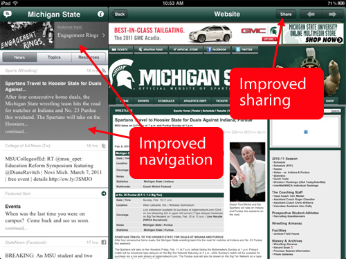
Users can now share the app and specific pages with their friends via Facebook, Twitter, SMS, and email.

iPad Redesign

We’ve made subtle changes to the iPad design to improve navigation. In short, now you always know where you are within in the app.

In college, I took a class about music in film. My professor talked about how the best music was never heard or remembered. It just made the film better.

For new users, the updates to our iPad design won’t be noticed. Instead, they just make the experience better.

Timing

Expect this update to be live by the week of February 21st. Our current customers won’t have to do anything.

In short, this update removes speedbumps. We think your users will love it.

Subscribe to the Cap & Compass Blog by Email

Promotional Package for your App

This post is part of a series on easy ways to get the word out about your app.

Want to send a strong signal out to your alumni or members about your app?

Beyond projecting a large silhouetted shape of your logo across the cloudy sky, we have some more traditional ideas for you.

As we review statistics and talk with our current app customers, one thing is clear: when the app is promoted, the app gets used (big surprise).

We make it super easy to get the word out. Once your app is live, we’ll send you a our free, custom promotional package with print and online ads.

Tips

Below are tips on how to use our package. Promote your app at least FOUR simple ways every year:

1) WEBSITE ADS
2) SOCIAL MEDIA
3) HTML EMAIL
4) PRINT ADS

Smart Link

First, you’ll see some common elements in most of these promotional pieces. The most important is your smart link.

A smart link recognizes the kind of device it is clicked on from, and directs your users to the right app store to download.  It is the most efficient way to get your reader to download the app. Here’s an example:

http://www.mycribsheet.com/msu

Try using this URL on your smartphone to see how it works.

You’ll also see a QR code – this is simply a scannable version of your smart link.  A smartphone user can see this code in a magazine ad or website ad, and scan it with their phone instead of typing the smart link address into their mobile browser.

1) Always: Website Ads

Place your (a) app icon and (b) one ad on your website:

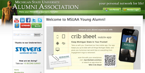
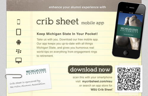
Our Small Website Ad

Our Medium Website Ad

Our Large Website Ad

2) Monthly: Social Media Annoucements

Announce your app (over and over again) via Facebook, Twitter, LinkedIn, and elsewhere:

MSU’s free new alumni app on your iPhone, iPad, Android, Blackberry, or desktop: http://mycribsheet.com/msu

Or, use our seasonal updates about certain topics, like taxes in April, voting in November, and engagement rings on Valentine’s Day:

Love is in the air (Feb. 14th). Read about engagement rings in “MSU Crib Sheet”, our mobile app. http://www.mycribsheet.com/msu

3) Annually: HTML Email

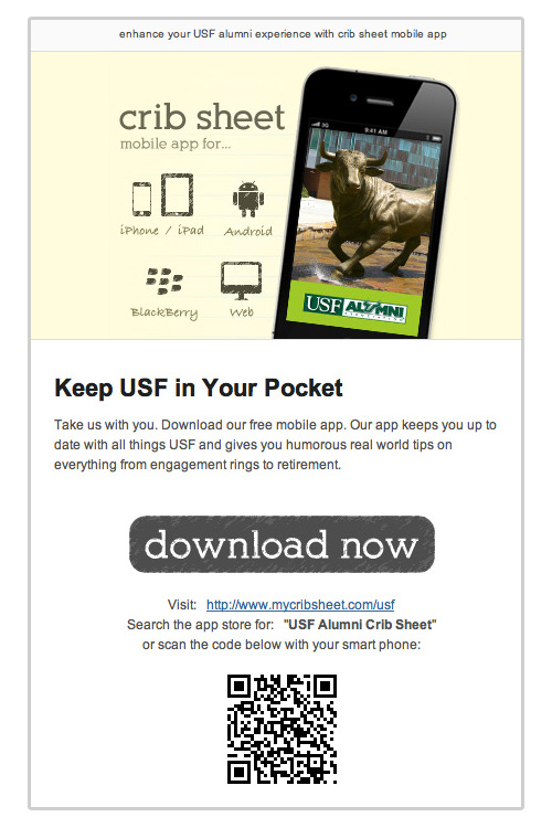
Use our template and/or include one of our on-line ads in your normal HTML email.

Our HTML E-mail Template

4) Annually: Print Ad

Place a magazine ad, add a buckslip to a mailing, or distribute pocket guides.

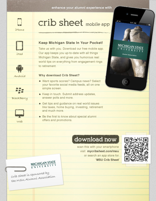
Our Full Page Magazine Ad

Our Half Page Magazine Ad

Buckslips
Include a 9″ x 4″ buckslip in your next mailing.

Our Buckslip

You can print them or contact us and we’ll print them at cost (the below rates include shipping):

2,500 = $400
5,000 = $600
10,000 = $1,200
15,000 = $1,800
+ add’l 5,000 = +$500

Pocket Guides
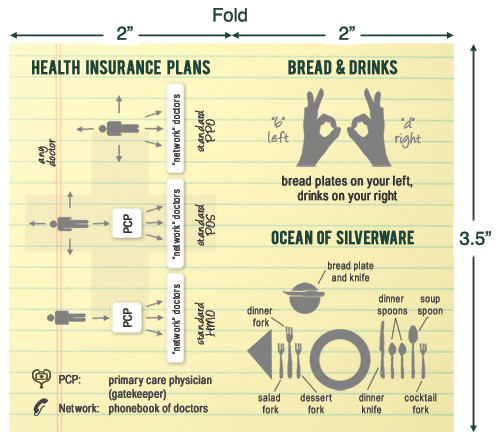
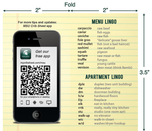
Give these popular, glossary cards at events. They fit perfectly in a wallet or pocket, and provide mini tips from our life skills topics.

Our Pocket Guide (Back)

Our Pocket Guide (Front)

Contact us and we’ll print them at cost (the below rates include shipping):
2,500 = $300
5,000 = $400
10,000 = $600
+ 5,000 add’l = + $200

Make It Your Own

We provide you the native Photoshop files to make edits (and finished PDF files).

If you decide to create your own designs, remember to include your smart link, QR code, and our basic language (these elements have proven effective in getting downloads).

Takeaway

Use our free custom artwork to promote your app at least FOUR simple ways every year:

1) WEBSITE ADS
2) SOCIAL MEDIA
3) HTML EMAIL
4) PRINT ADS

Our current customer statistics show that once a user downloads the app, they return to it again and again.

Give your app the superhero treatment with our promotional package. Our stuff even works on cloudless nights…

Let us know what we can do to help by contacting Nicole at nicole@capandcompass.com.

Subscribe to the Cap & Compass Blog by Email

BlackBerry App is Launched

For all you CrackBerry users, we’ve finally got your fix. We’re very excited to announce that “crib sheet,” our mobile app, is now available on BlackBerry.

The Case for BlackBerry

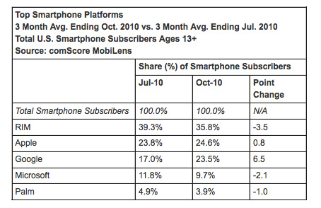
In recent stats (below), BlackBerry (RIM) is still the number one smartphone in the US.

While BlackBerry phones aren’t used for apps as much as the iPhone or Android devices, you can’t ignore the platform simply due to its sheer number of users.

By being on BlackBerry, our “crib sheet” app has the potential to reach a much larger audience.

Our BlackBerry App Journey

We started our BlackBerry development process at the same time as our Android development. We had just rolled out our app on the iPhone and it was time to expand to other platforms.

BlackBerry set itself apart in the development process because, frankly, their phones aren’t built to run apps. They were built to provide mobile email to the corporate masses.

The most obvious limitation is the screens – they’re often small and low resolution. The stuff “behind the screen” is limited too: tools for BlackBerry developers are sparse.

If coding an app is like building a house, Apple gives you a frame while BlackBerry makes you saw boards from trees. Consequently, the look and feel for many BlackBerry apps is often pretty basic.

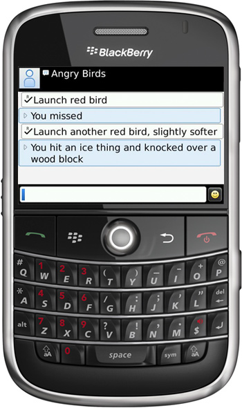
There’s a joke circulating on the internet for how the popular Angry Birds app would look on BlackBerry.

Angry Birds App on the iPhone

Angry Birds App as imagined on BlackBerry

Other complexities in our BlackBerry process:

– a bazillion screen sizes,
– close to a bazillion versions of the operating system on old devices
– quite a few user input methods (touchscreen, keyboard, and hybrids)

Despite these limitations, I was determined to build an app that was sweet to the eye and fun in your hand. I started by contracting with one of the best BlackBerry design firms (there aren’t many) in the industry.

Much the same as Android, we started with high-level wireframes (blueprints):

Then began to get more specific:

And finally they created some pixel-specific drawings:

With final plans in hand, we forged on with a talented team of BlackBerry coders. We’re super proud of the result.

View the BlackBerry App

To see our BlackBerry app for yourself, visit one of our customers’ desktop app sites. Then click on “BlackBerry” on the top right of their page.

Our “crib sheet” app runs on BlackBerry devices with an OS of 4.6 and higher, making it available on all but the very oldest BlackBerry models.

We think your users will love it.

(Note: For those few of you with a “touchscreen” Blackberry, our app will be ready for you in another week.)

Subscribe to the Cap & Compass Blog by Email