Products with Soul

Some of the most successful products on the market today may not differ much from their competitors, except for that thing that’s hard to define: soul.

Take Ben & Jerry’s.

Their brand isn’t about just ice cream. The company sends their ice cream waste to a pig farm, where the pigs run at the first sight of their truck. It’s my daughter’s dream to be reincarnated as one of those pigs. That’s soul.

Many companies try to manufacture soul. Chain restaurants put local high school teams on their wall and adorn their servers with crazy pins.

Right out of the starting gate, I wanted our products to have soul.

Prior to writing our content, we surveyed other books and websites that tried to explain “life skills.” Generally speaking, they were just boring.

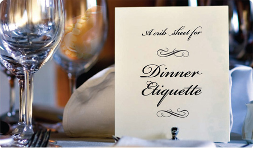
So we focused on being smart and concise with a quirky sense of humor. Take this example from our topic on dinner etiquette:

On a business dinner, it’s always nice to extend your hand when you first meet (no fist bumps). A proper handshake involves eye contact and three-second, firm grip. That’s it. And don’t count to three out loud.

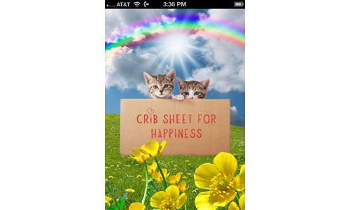
We keep this cheeky tone in the “life 101” photos from our app:

Soul is that “special something” that often connects people to brands. Our content has soul… which you can use to build your brand with alumni.

Subscribe to the Cap & Compass Blog by Email

Details Matter

A few years ago, my wife and I were on vacation in Costa Rica at a resort called Tabacon.

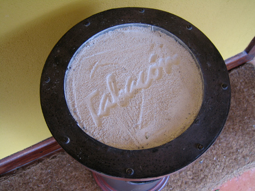
Despite the novelty of sleeping at the base of an active volcano, what I remember most is the hotel staff who obsessively stamped the Tabacon logo into every ashtray.

Sometimes I’d muss the sand just to see how long until it got fixed. Not long — the attention to detail was incredible.

I wanted to bring that same attention to detail to our “crib sheet” app.

One of the more popular details are our topic photos. These were a labor of love, as we often spent a few days per photo. Our steps included:

– Brainstorm how to visually represent a topic
– Search stock photo sites for building blocks
– Using Photoshop, stitch all of the pieces together
– Share with friends and revise, revise, revise

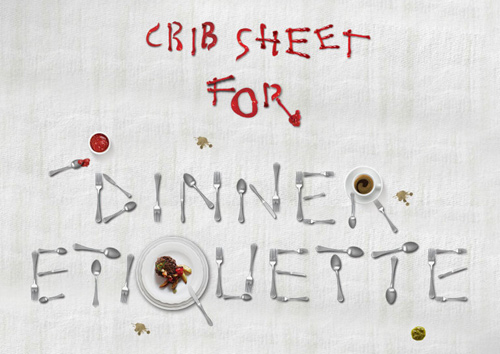
Sometimes we got stuck. How do you visually present “Dinner Etiquette”?

Idea #1: Add the topic name to a dinner menu, but visually it wasn’t very interesting.

Idea #2: Show a place setting with some dentures in a glass, but the joke was easy to miss.

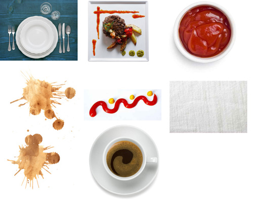
Idea #3: Reconstruct the topic name out of silverware and ketchup (of course!). So we found the following eight photos:

And after hours of work on Photoshop using only the above images (Sue, you’re the best), we created our Dinner Etiquette photo:

In other photos we include a little joke (hint – look bottom-right):

With my background in banking, I enjoyed designing the photo for our Investing topic:

Finally, my favorite has to be Identity Theft:


As I created “crib sheet,” I didn’t want to throw a lot of stuff from a customer’s website into a phone and call it an app.

I wanted our app to have soul — something that people would proudly share with their friends. We hope you love the details.

If you’re interested, see all of our photos on your computer.

(For BlackBerry users, our photos unfortunately didn’t make it into your app due to size constraints. But we tried!)

Subscribe to the Cap & Compass Blog by Email