The Clementines In My Kitchen
Everyone in my home loves clementines. They’re sweeter and juicier and easier to peel than the ordinary oranges.
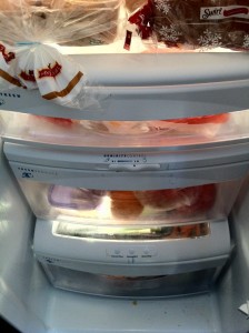
Just the other day, Nicole purchased a big bag and put them in our fridge. When I heard about this big news, I immediately pulled out two and ate them like candy.
The next day, I walked through the kitchen on my way upstairs. I thought about eating another clementine (or two), but I pictured myself:
1. walking four feet out of my way to the refrigerator,
2. opening the door,
3. opening a few drawers (I usually open the wrong one first),
4. taking the bag of clementines out of the drawer,
5. finding the opening in the bag,
6. removing one clementine,
7. putting the bag of clementines back into the refrigerator,
8. closing the drawer, and
9. closing the refrigerator door.
Easy enough? Yes. But these small speedbumps were enough for me to say to myself, “I’ll just get one when I come back downstairs.” And then I forgot.
And I wasn’t alone – over the course of the week, the clementines in my home weren’t “selling”. They were loved, but they were out of sight and less-than-easy to get.
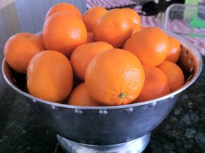
Nicole, who actually thinks about things like “marketing” healthy food to our family, pulled the clementines out of the fridge and put them on the kitchen counter in a shiny bowl.
Unsurprisingly, every clementine was eaten in three days (mostly due to me).
So what changed? The clementines were now in my line of sight and super accessible.
Everyone knows that a figurative “speedbump” slows down action, but few people appreciate that even the smallest speedbumps can have a big effect.
In the making of our app, we asked this question: How can we remove every single speedbump for users so that they return to our app over and over again? Below are two examples of decisions we made to address this question.
Native App
We built our apps as native apps (apps built for specific devices) rather than creating a mobile website (cheaper alternative). By doing this, users always have an app icon on their phone.
Why is this important? Because the clementines should be on the kitchen counter. Every time a user looks at their phone, they’ll have the chance to see their school’s logo in a pretty box and tap on it.
Location of News
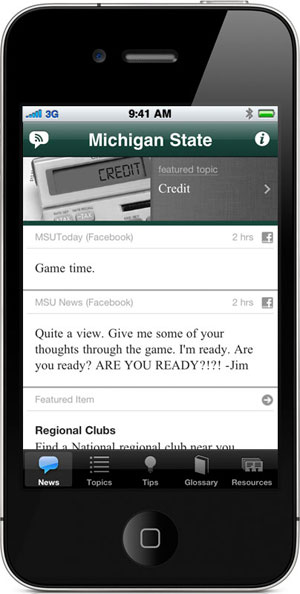
Users usually return to our app to read current news from their alma mater. So what’s the absolute fewest number of taps to get this news? ONE.
When the icon for our app is tapped, the first screen a user sees is their news. Done.
We’ve seen some other apps that take a different approach.
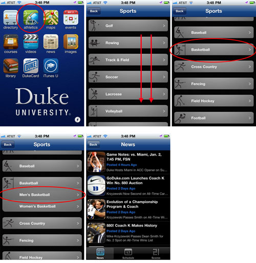
Duke University has a good app for their current students, but as an alumnus of Duke, I only want to read about basketball news (in my day, I was one of those fans). To get these updates, I need to tap five times:
Simple? Yes.
Why is five taps too many? Because the clementines shouldn’t be buried in the refrigerator. A few extra taps can mean the difference between returning or not returning to an app.
When you’re planning an event or asking for your alumni or members to do something, think about the smallest of speedbumps. Removing these can make all the difference.


