Update to iPhone/iPad App
In a previous post, I wrote about the benefits to removing “speedbumps” to increase usability.
We obsessively look at our app, crib sheet, for “speedbumps”. When we find them, we go at ‘em with jackhammers.
To that end, we’re excited to announce a big update for the iPhone and iPad.
Much Faster
Behind the scenes, we’re processing thousands of social media feeds from our customers’ apps. We’re kind of like Grand Central Station.
When you open the app to get updated news, you want it now. So we redesigned the “plumbing” for downloading these new feeds. The difference, depending on a variety of factors, can be significant: 3 seconds vs. 20 seconds.
Visual Tricks
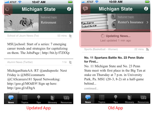
When the news feed is updating, we now hide the “Updating News…” tray and give users the ability to read old feeds while their new feeds are added.
By making this change, the app “feels” faster.
Improved Sharing
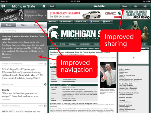
Users can now share the app and specific pages with their friends via Facebook, Twitter, SMS, and email.
iPad Redesign
We’ve made subtle changes to the iPad design to improve navigation. In short, now you always know where you are within in the app.
In college, I took a class about music in film. My professor talked about how the best music was never heard or remembered. It just made the film better.
For new users, the updates to our iPad design won’t be noticed. Instead, they just make the experience better.
Timing
Expect this update to be live by the week of February 21st. Our current customers won’t have to do anything.
In short, this update removes speedbumps. We think your users will love it.


