Product Design: What We Believe

We believe that design (broadly defined) is the key to any good product, so we felt that we should share our design beliefs with you.

OUR BELIEFS

Attention to detail
We obsess over fonts, shades of color, and the pixels in an icon. Details matter and get remembered by customers.

Curation
We remove stuff to create value. We explain health insurance in about 500 words.

Minimize friction
We minimize taps and headaches. If you don’t notice friction in our products, then we’re doing our jobs.

Focus
We don’t do everything. By focusing on just news, life 101 topics, and deals in our app, we have the time and attention to do these things well.

Mobile is unique
For our app, we design specifically for tiny, touchable screens used by real people with short attention spans.

No whiz-bang
We don’t add features which sound cool but get used just once.

Soul
We make products to be loved and shared. Our life 101 topics have soul.

Respect users
We ask ourselves, “Would we like this?” when building something. Our approach to advertising is respectful.

TAKE AWAY

We have a responsibility to our customers and users to produce great products. If you believe what we believe, then you’ll love our book and app.
Subscribe to the Cap & Compass Blog by Email

Your Mobile Strategy: A Fish or Dog?

When my daughter turned five, she begged my wife and I for a pet. So we got her a “starter” pet, a goldfish.

For a day or two, she watched “Peter Pan” swim in a circle. But after a week, her fish got ignored (“he’s kinda boring”).

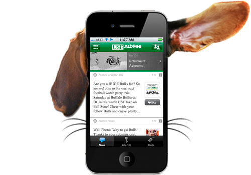
When my daughter turned seven, she begged for a “petting kind of pet”. So we brought home Maggie, a basset hound. Six months later, I took this photo:

My daughter is still obsessed with Maggie because she greets her at the door, delivers her teddy bear, and makes her smile. Maggie is an interactive part of my daughter’s life. Therefore, she gets a lot more attention.

As you plan the mobile strategy for your office, ask yourself: are you giving your alumni a fish or a dog?

Mobile websites often fall into the fish category. They look better than a regular website on a phone, but the content doesn’t change much and they don’t offer anything to engage alumni:


Our app is the basset hound in this analogy by:


And if you already have a mobile website, our app is a great tool to send more traffic to it.

TAKE AWAY

Give your alumni something as interesting and interactive as news, life tips, and deals in a beautiful format and they’ll return again and again (and stay engaged with you).

Subscribe to the Cap & Compass Blog by Email


Reduce the cost of your app with helpful ads

In our app, we give you the option to include relevant, useful ads to help you reduce the cost of your app.

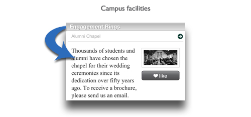
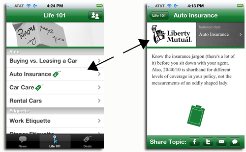
To do this, we start with a crazy idea: ads should improve the app experience of your users. If your alumnae reads about “auto insurance,” she might appreciate learning about an auto insurance discount available to her.

So we designed Crib Sheet from the ground up for “good ads” (nothing obnoxious):

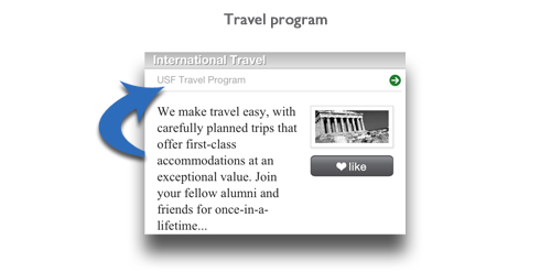
– Each ad is related to a life 101 topic (e.g. auto insurance)
– Maximum of one ad per topic
– Only your partner ads (affinity partners or ads you’ve sold)
– Ads visually match the app design (nothing annoying)

Search for “MSU Crib Sheet” in any app store to see ad examples in an app.
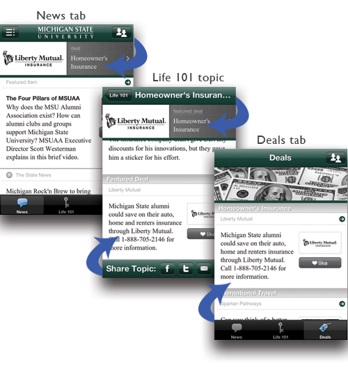
Automatic Discount (Sponsors)

To help you easily reduce the cost of your app through ads, we’ve partnered with some of the country’s top affinity partners as app “sponsors” (e.g. Liberty Mutual).

To receive an automatic discount off your app subscription, promote your affinity partner (sponsor) by:

– including their ad(s) in your app
– incorporating their logo in some of your app promotional materials

Sell Ad Space (do a little legwork)

If you’re in contact with any other advertisers (besides our sponsors), you can sell your own ad space in the app:

– Keep 100% of the revenue (you choose the ad rates)
– Ads need to be related to a topic
– We provide you an (optional) “ad-sales sheet” to provide to your advertisers
– If you sell ad packages (print, web, etc.), add the app to your “ad portfolio”

Promote Internal Partners

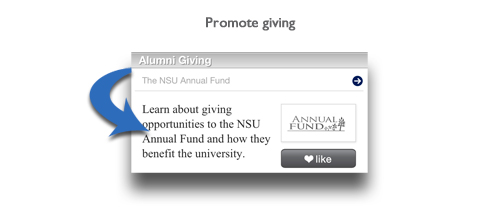
As an added bonus, promote products and services from your own organization as “deals” in your app:

Controlled by You

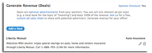
You can add, edit, and delete your deals right from your dashboard:

And you can even send automated emails to your advertisers showing statistics and more.

Takeaway

Alumni appreciate these limited and relevant ads in their app because they provide real value when reading about a given topic.

Take advantage of the financial benefits of ads with little effort (a sponsor discount) and/or a little hustle (sell ad space). You never know, you could even get paid to provide this valuable app to your alumni.

Please contact us with any questions!

Subscribe to the Cap & Compass Blog by Email


Get More Users: Crib Sheet 2.3

Our new update provides powerful signals to direct new and repeat users to our app. We’re proud to debut push notification, improved sharing via Facebook and new branding touches.
Push Notification

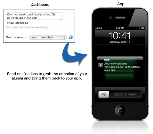
Push notifications allow you to send messages directly to the people who have installed your app, even when the app is closed on a device.

Send (and schedule) unlimited notifications right from your dashboard. You can even send users to specific pages in your app, like an address update form.

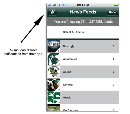
Your alumni have control over their notifications.

When used right, push notifications can be a powerful communications tool within your larger communications strategy.

“Liking” of Stories

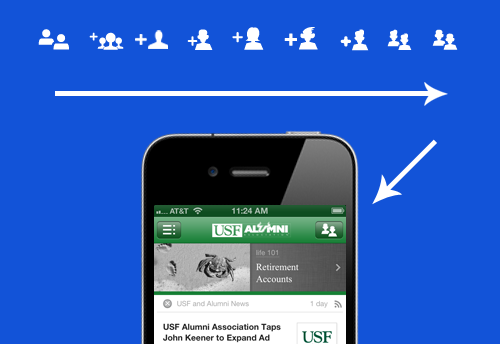
Since sharing is so important to the growth of your app in your alumni network, we’ve added the ability to easily “like” stories.

Now with one simple tap, “liking” a story sends a short message to friends on their Facebook pages. Links within these Facebook messages make downloading your app easy.

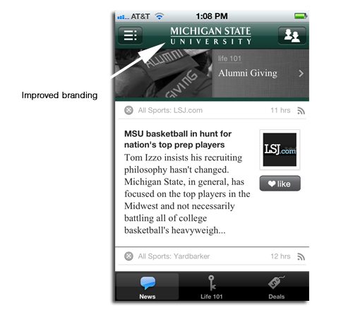
Improved Branding

On iPhone and iPad, we now include a vertical, white logo to improve the branding in your app.

We hope everyone loves these updates! Stay tuned for more…

Subscribe to the Cap & Compass Blog by Email


Our new “Web App”

We excited to announce some key improvements to our “web app,” the version of our app viewable on any computer browser (like Explorer, Firefox, or Chrome).

We’ve increased the presence of your brand, and made a ton of changes to improve the overall reading experience.

And just like on iPhone, iPad, Android, and BlackBerry, users can personalize their news feed. We think they’ve love it, and use it.

So, why have we put so much effort into this version of Crib Sheet which isn’t used on a mobile device?

Eyeballs

Your alumni and members still use computers… for lots of hours. We want your news to be easily accessible your users spend their online hours.

We see the web app as something that your alumni will use frequently (some as their home page) to keep up with your latest news.

Discovery

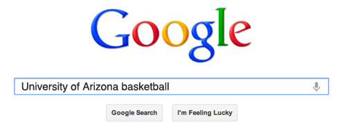
When someone wants to read about an event at Malone University or a score for BU hockey, they often search in Google. Why not send this interest your way?

Some of these searches will send your alumni to your branded desktop app where they’ll read more news, download the app to their mobile device, and become more engaged with you.

Takeaway

Our new web app is now easier and more fun to use. We think this platform will be a go-to source for your institution’s news and life 101 tips for many of your alumni sit in front of a computer all day.

This update is live for all of our customers. We hope everyone loves it!

Subscribe to the Cap & Compass Blog by Email

Digging for Your Social Media Feeds

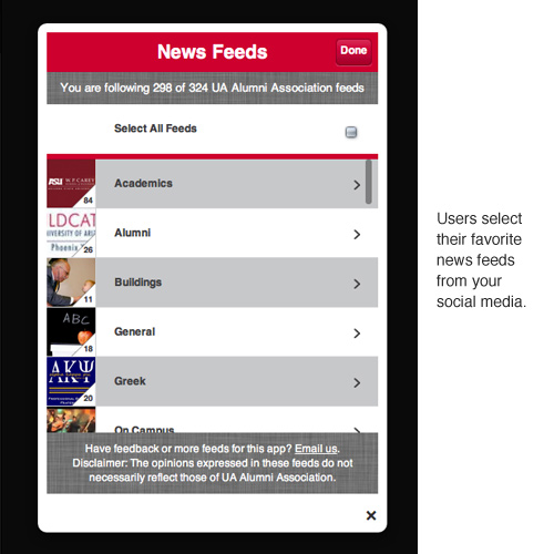
Your organization may have tens or even hundreds of news feeds across Facebook, Twitter, YouTube, Flickr, RSS, Pinterest, Vimeo, and so on. For your alumni, finding the specific news they want to follow is hard.

The newest version of our app debuts several improvements targeted at getting your users to easily see and follow your social media.

We Find All of Your Feeds

Like pigs hunting for truffles, we sniff out (almost) ALL of the social media from your organization (alumni and greek chapters, sports blogs, student clubs, academic departments, and so on) and serve them up in one simple app.

Providing lots of niche news choices is key to building a strong alumni news following. Let’s say you have an alumnus who played soccer, studied history, and belonged to Kappa Delta Something. He or she wants to read news tailored to those interests.

Categories

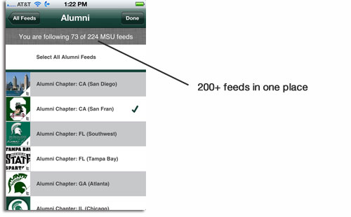
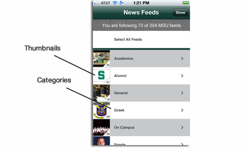
Some organizations have a LOT of feeds (some of our customers have 250+). To make finding those niche interests a little easier, each feed is listed within a useful category such as “Sports” or “Academics”.

Feed Images (thumbnails)

To make the app fun and engaging, we attach a tiny “thumbnail” image to every news feed to give the user a visual sense of what the feed is all about.

Easy to Customize

As you add (or we find) additional feeds from your organization, these new feeds are highlighted in a “New” category, making discovery of news fun and easy.

Also, users can remove feeds (but not your features) by simply tapping on a little “x” next to those stories which they don’t want to read.

Takeaway

A fundamental demand exists for your organization’s news. This demand is currently being met by a variety of websites and social media. Now your office can satisfy this hunger by offering all this news to your alumni in a beautiful app… branded by you.

Subscribe to the Cap & Compass Blog by Email


What’s all the buzz about? Crib Sheet 2.0

Over the past few months, we’ve been busy bees building a great new update to our app, Crib Sheet. Now we’re really excited for you to see what all the buzz is about.

More Beauty

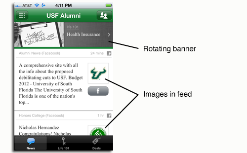
The most obvious improvement can be seen in the news feed. We’ve added an image to every story to add more beauty and “pop” to the app.


The banner at the top of the news tab also rotates to make the app feel more “alive”, and to remind users about all of the great content the app has to offer.

Easier Sharing

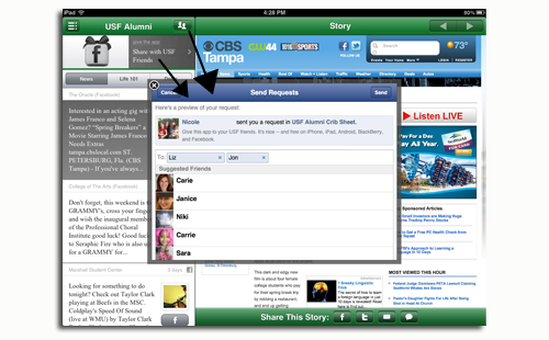
You’ll find one-tap sharing on almost every screen of the app. We think that easier sharing on Facebook, Twitter, email, and SMS will result in many more downloads and visits of your app.


Since Crib Sheet is customized for a school or organization, we think sharing the app with a smaller group of friends (e.g. fellow alumni) is more powerful than sharing with ALL friends.

So, we’ve added a special Facebook sharing function which allows users to share with friends from ONLY your organization.


Faster

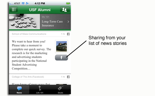
Speed in an app is crucial, so we found ways to increase speed and reduce taps everywhere. For example, you’ll find a faster news feed and one-tap sharing right from your news feed.


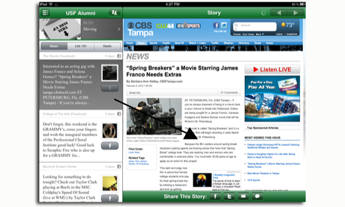
In addition, tapping on a news story now takes you directly to the full article, which is particularly powerful on the iPad:

More Guidance

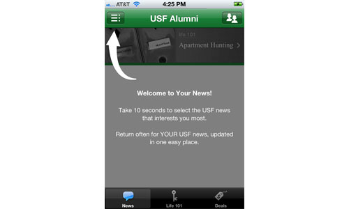
We provide more instructions for the best way to enjoy the app.

Our rotating banner provides more helpful tips.


Relevant Ads

We view advertisers as important partners to the app.

Our advertisers give schools the chance to subscribe at discounted rates and they give users the chance to take the “next step” when learning about auto insurance, investing, etc.

So we’ve made ads more visible (when in context) within our life 101 content.


It’s with great excitement that we debut these updates. Search almost any app store for “Crib Sheet” to see many customer examples.

We welcome feedback or suggestions – e-mail me. We are already back in the hive, working to make your app experience even sweeter.

Enjoy!

Subscribe to the Cap & Compass Blog by Email

FAQ: How To Close Your App

This is a quick “frequently asked questions” post if you want to show off your beautiful load screen or view an update made from your Dashboard.

The short answer: close your app then re-open it.

Sometimes your app stays open in the background as a benefit of “multi-tasking”. Your app will close on its own after a period of time, but you can force close it now using the following steps:


Subscribe to the Cap & Compass Blog by Email

Promoting Your App Via Social Media: Do This, Not That

This post is part of a series for our customers on easy ways to promote your app.

Have you ever read the “Eat This, Not That” books? They’re fun books that not only tell you what’s bad for you, but they give you a healthier alternative.

I hope this post will give you similar “healthy” tips for promoting our app (or any app) via your social media and get you more downloads.

A Typical Mobile Reader

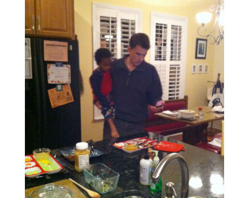
I’d like to caption the above photo: My husband reading e-mail while holding toddler and doing dishes.  The truth is that your typical “mobile reader” is a multitasking alum with a short attention span and a tiny screen.

The below tips will help get your typical mobile reader to quickly download your app.

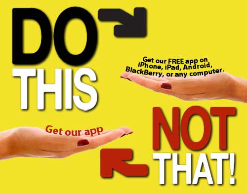
Tip #1: Keep it simple.

Link directly to the app (using our smart link, see Tip #2). If you send users to another page describing the app with more instructions for downloading the app, they’ll give up.

Tip #2: Make your links tappable. 

If the “http://” prefix is in your link, it will usually be tappable (otherwise, it may just be text). In the above example, our smart link recognizes the reader’s device, and gets them to the right app store to download the app.

Tip #3: Use your actual app name.

Some readers will search for your app in an app store. If you supply extra words, their search results might be empty.

Tip #4: Give specific reasons to download the app.

Tell them it’s FREE, available on iPhone, iPad, Android, BlackBerry, and any computer. It’s full of news from you and useful life tips.

Tip #5: Don’t use QR codes in social media.

QR codes are cool, but they’re best used in print ads. A QR code is scanned by a phone. If users read your post on their phones, they would need to set up a complicated set of mirrors to scan your QR code.

Here’s an ideal post (from a fictional college):

##

The “Faber Alumni Crib Sheet” is live! Search for our FREE app in any app store with timely news from us and humorous life 101 tips for you. It’s available on iPhone, iPad, Android, BlackBerry, and any computer. Learn more at http://www.mycribsheet.com/faber.

##

And if your creative juices are running low, we’ve got monthly post suggestions for you. Or, feel free to run a post by me at nicole@capandcompass.com.

Subscribe to the Cap & Compass Blog by Email

A Happy Update To Our Crib Sheet App


One of our newest topic photos

The happiness of our customers is what drives our happiness, which makes us very pleased to announce a great new update to our Crib Sheet app.

Thanks to the great feedback from our buyers and users, we’ve made a bunch of improvements which make the app easier to use and understand.

What’s the most important highlight of this update? Five new smart and helpful topics that range from the keys to happiness to the keys of a rental car.

(1) Happiness: Yep, read this topic and you’ll be happy forever.

(2) Disability Insurance: Prepare yourself for that “staple injury” that prevents you from earning a paycheck.

(3) Wills & Trusts: We know you’ll never die, but just in case… we’ve got your crib sheet for planning for the stuff and people you’ll leave behind.

(4) Long-term Care Insurance: Until the Fountain of Youth is sold in aisle 6, this topic is a must read.

(5) Rental Cars: We help you navigate all those extra fees, insurance choices and more.

We hope you love the new content. And stay tuned, because we have more exciting updates to come soon.

Subscribe to the Cap & Compass Blog by Email